
Watch Mission Details UX
Overview
ROC Watch is a video analytics platform that helps security and operational teams monitor video and access relevant intelligence. Operators rely on the platform to review information and maintain awareness of operational activity.
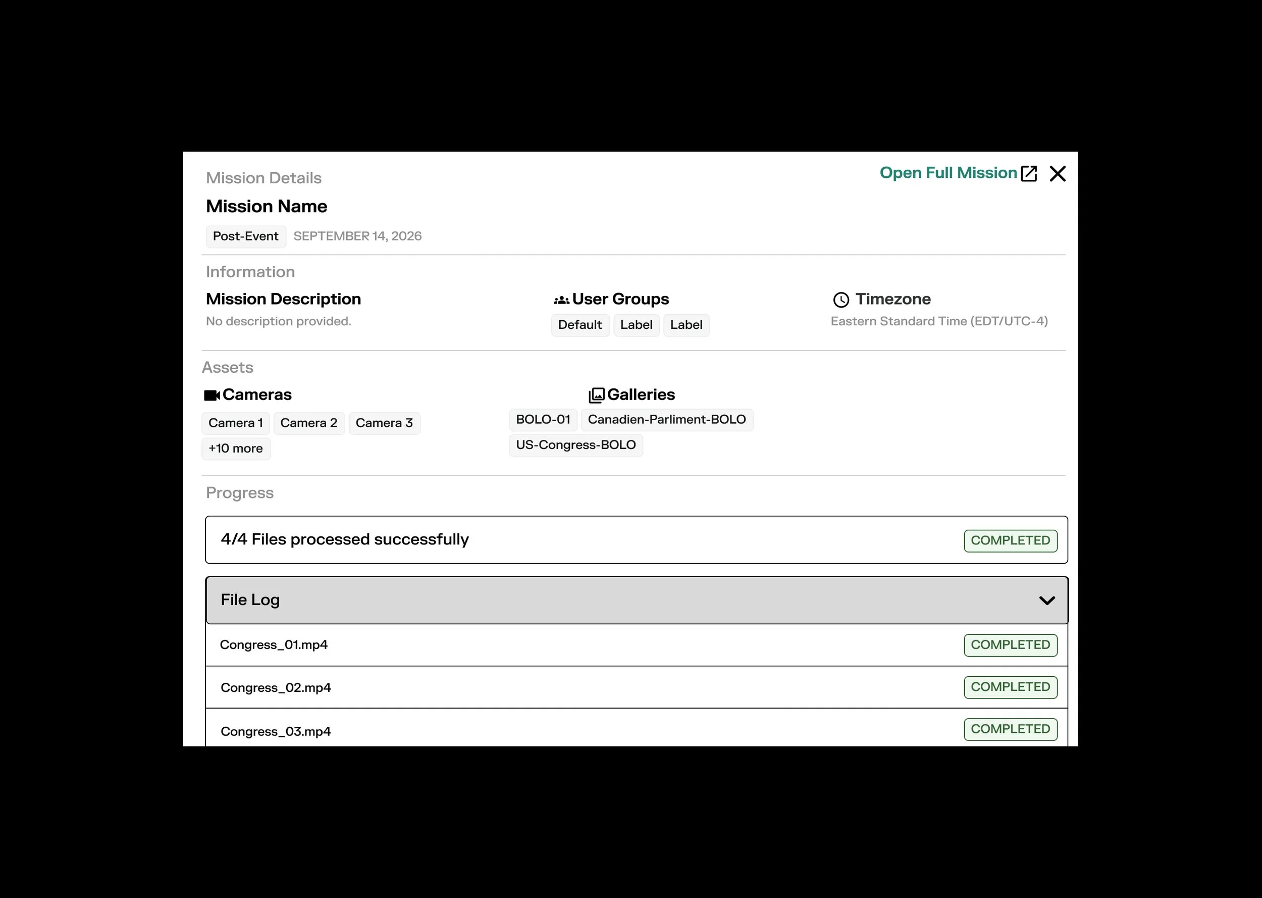
During my UX/UI internship at Rank One Computing, I redesigned Watch Mission Details to give operators a more flexible way to access individual mission information. I designed two complementary experiences: a mission details modal for reviewing information within the current interface and an option to navigate to a dedicated full mission page for a more comprehensive view.
The goal was to make mission information easier to access and explore without requiring operators to change their current priority selection.
Role: UX/UI Design Intern
User Research, UX/UI Design, Branding, Interaction, and Prototyping & Testing
Collaborated with the Research and Engineering teams to redesign Watch Mission Details and create a dedicated full mission page that allows operators to explore mission information without changing their current priority selection. Owned flow exploration, wireframing, interface design, component application, prototyping, and design presentations. Contributed to discovery, design critiques, and iterative improvements by incorporating stakeholder feedback while considering user needs and technical requirements.
Year: June 2026 - August 2026
Platform: ROC Watch (web-based AI video analytics and physical security platform)
The Challenge
Operators need to review individual mission details while maintaining awareness of their current operational priorities. However, accessing more information should not require them to disrupt their existing workflow or lose track of the mission they have prioritized.
The challenge was to create a more intuitive way to explore mission information while accommodating different levels of detail.
A quick review and a deeper investigation serve different needs. Relying on a single viewing experience may not provide the flexibility users need when moving between an overview and more comprehensive mission information.
Opportunity
How might we give operators flexible access to mission details while preserving their current priority selection and maintaining continuity within their workflow?
Constraints & Context
Watch Mission Details was designed within the existing ROC Watch platform, meaning the new experience needed to fit into established workflows and interface patterns.
Three considerations shaped my design approach:
Operational continuity: Operators needed to explore individual mission information without changing which mission they had prioritized.
Flexible information access: The experience needed to accommodate both quick reviews and more comprehensive exploration of a specific mission.
Product and technical alignment: The designs needed to remain consistent with the existing interface and account for technical requirements discussed during collaboration with Engineering.
These considerations informed the decision to explore two complementary ways of accessing mission details rather than relying on a single view.
discovery & Understanding
I reviewed existing workflows and stakeholder feedback to understand the product context and how mission information fit into the broader ROC Watch experience.
This discovery phase helped me frame the design challenge around information accessibility and workflow continuity. Rather than treating the mission details experience as an isolated page, I considered how operators could access additional information while remaining oriented within the product.
I focused on three design opportunities:
Improve access: Make it easier to open and review information about a specific mission.
Preserve context: Allow users to explore mission details without changing their current priority selection.
Support different levels of exploration: Provide a lightweight way to review information alongside an option for a more comprehensive view.
These opportunities informed the structure and interactions explored in the design phase.
Design exploration
I explored how operators could access mission details without interrupting their current workflow.
A key consideration was deciding when users would benefit from viewing information in the existing interface versus navigating to a dedicated page.
I approached this by designing two complementary experiences that support different levels of information access.
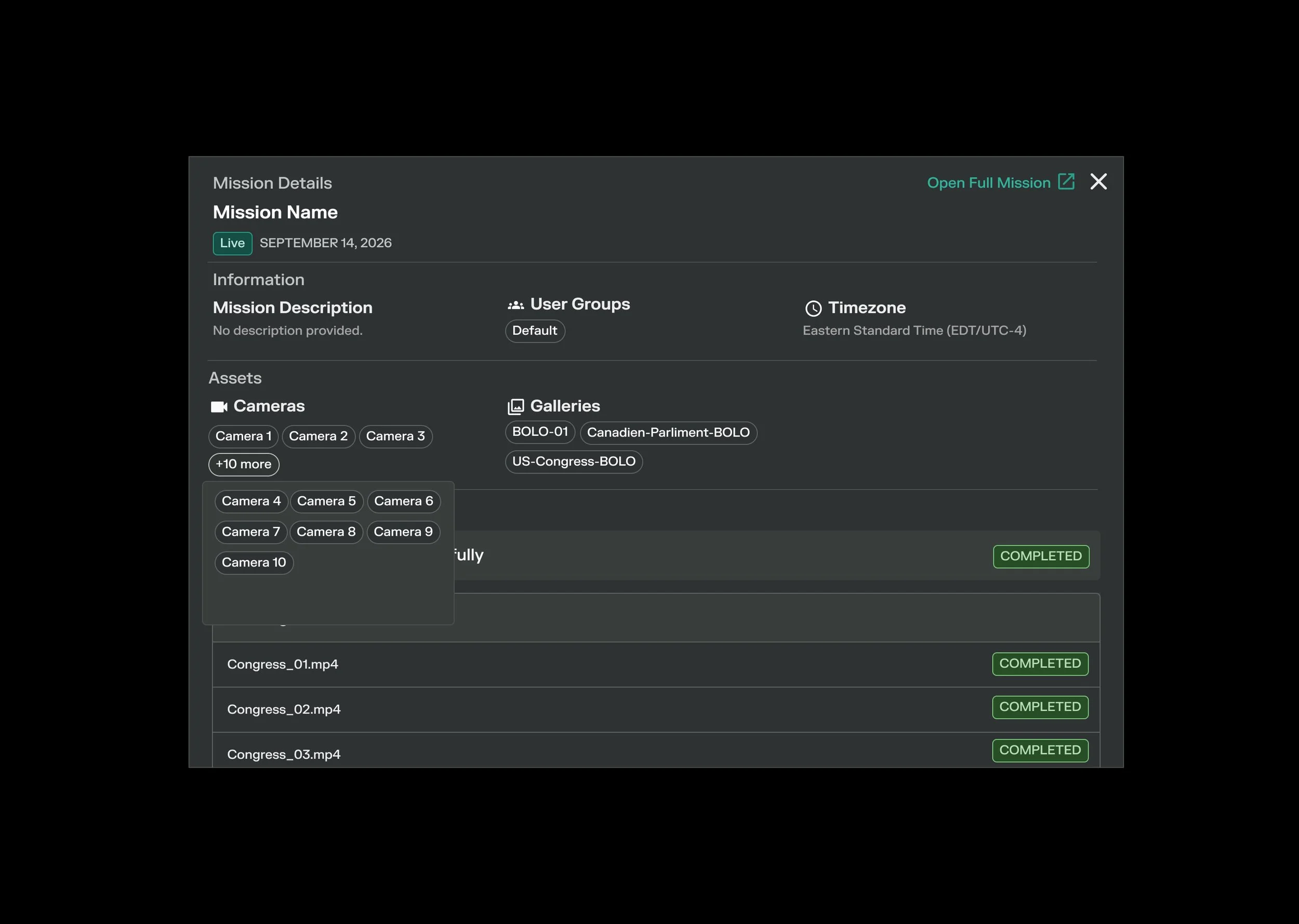
Mission details modal
The modal provides an in-context way to review information about a specific mission. It allows operators to access mission details without immediately navigating to a separate page.
This approach supports quick access to information while keeping the surrounding interface in view.
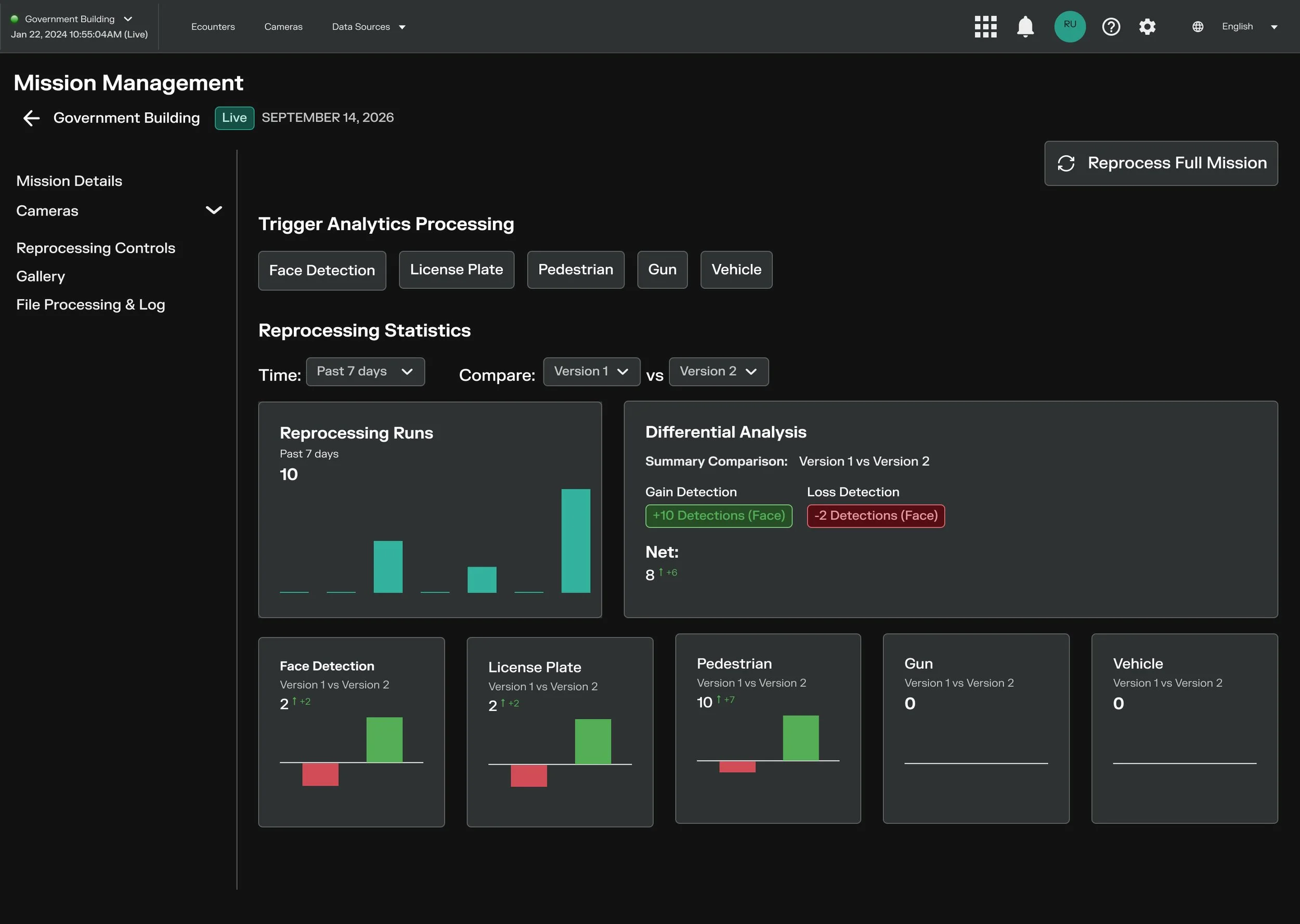
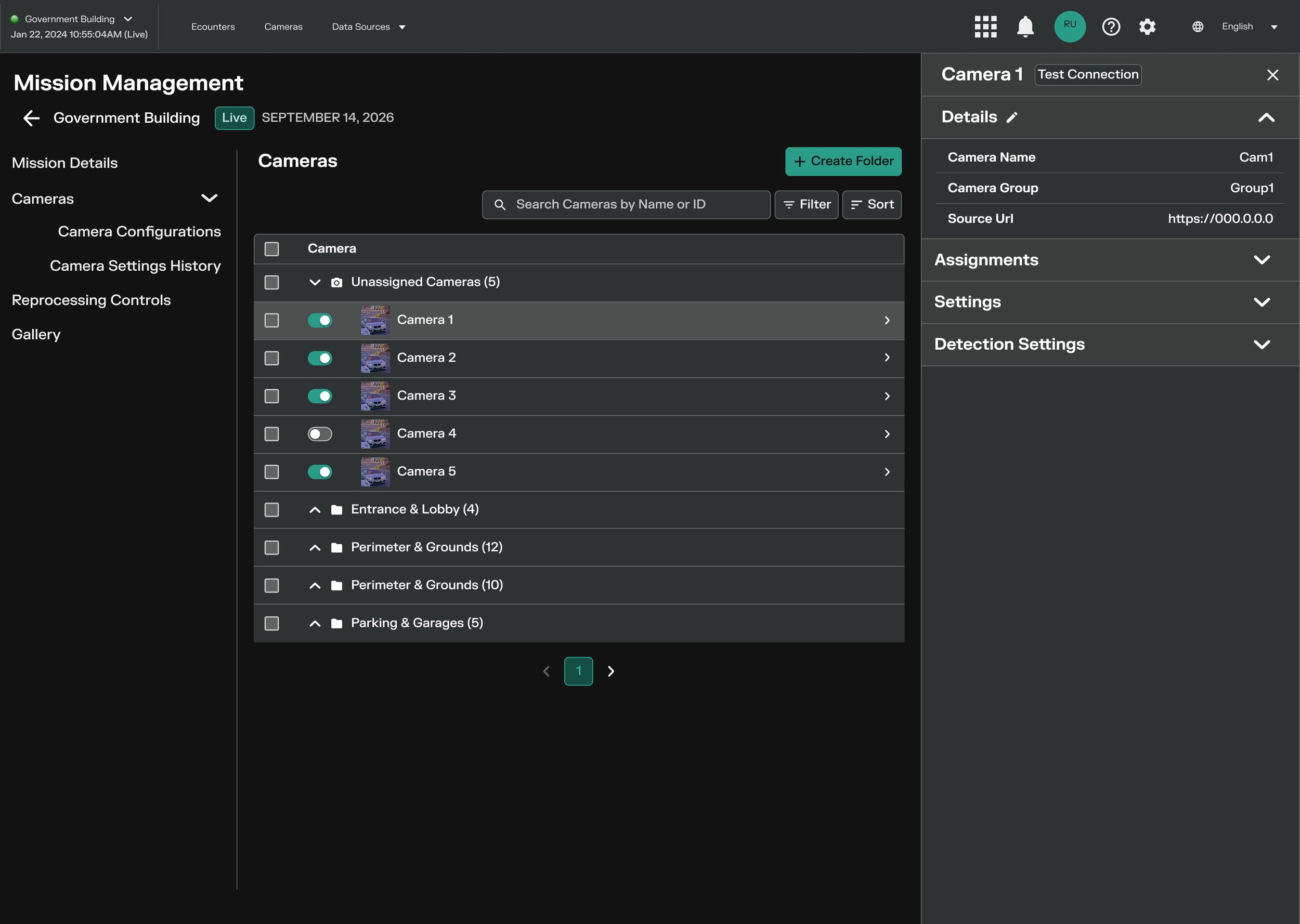
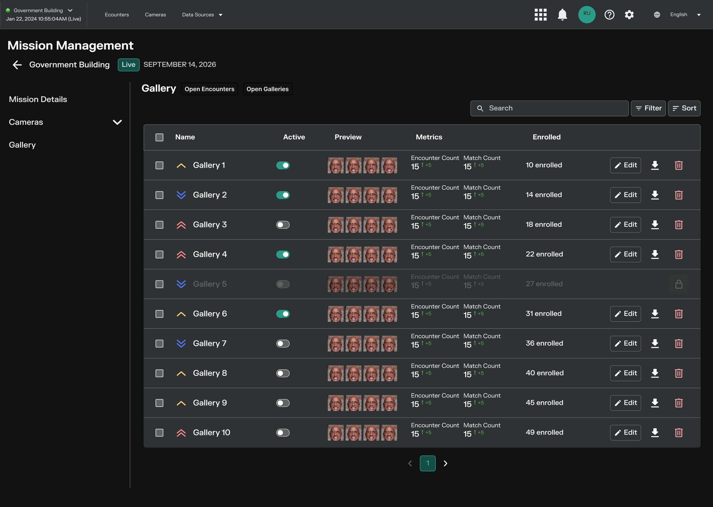
Full mission page
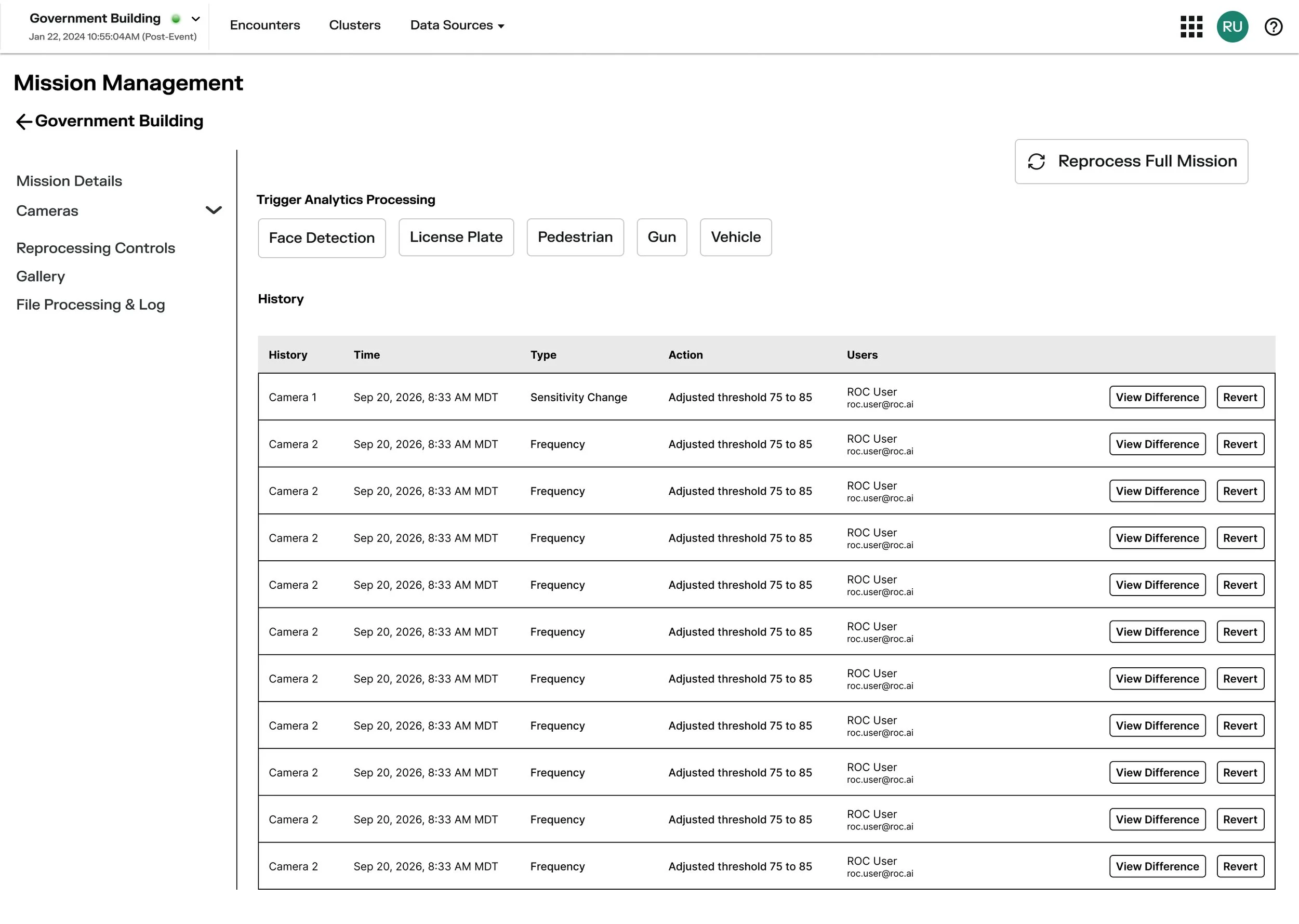
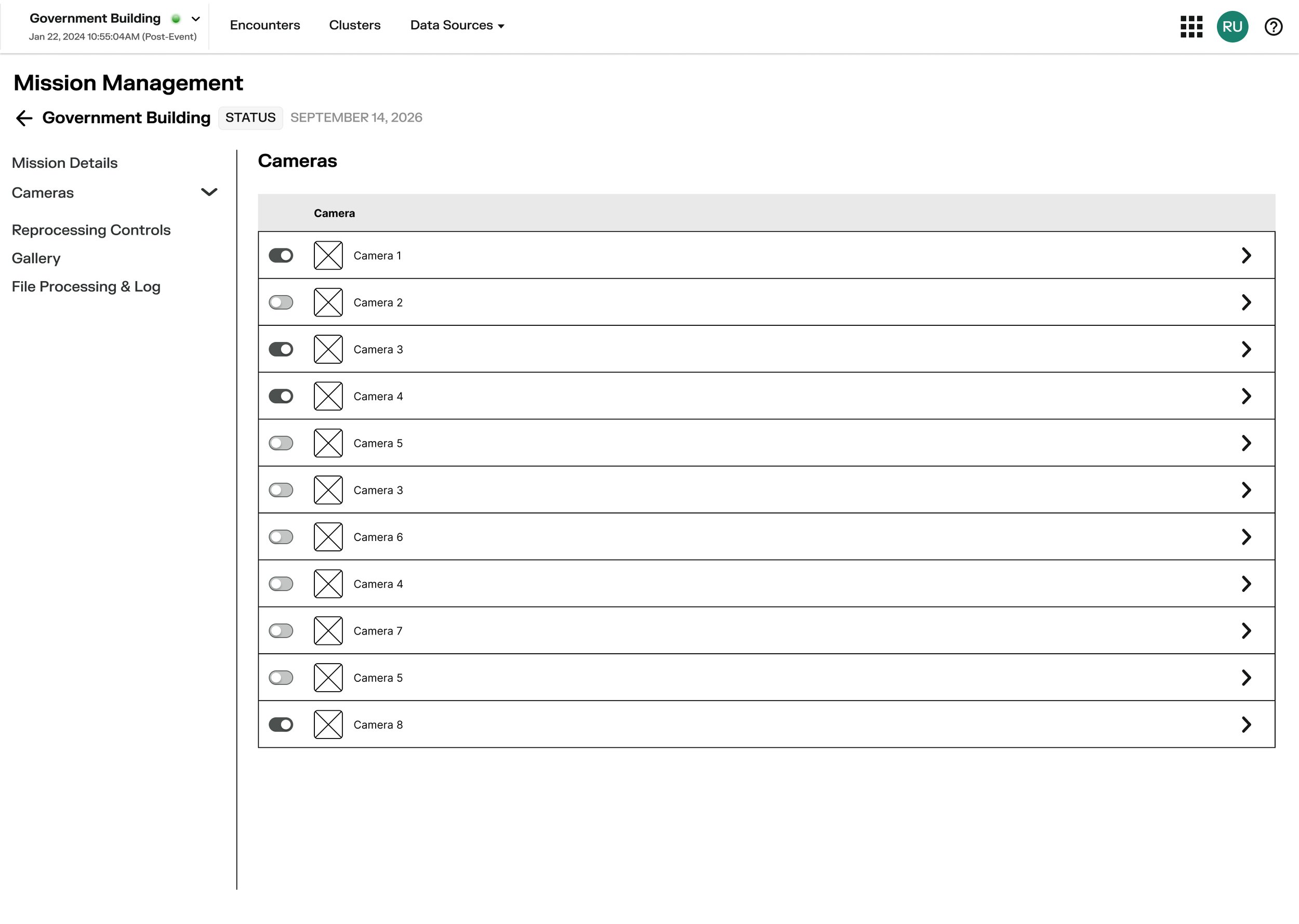
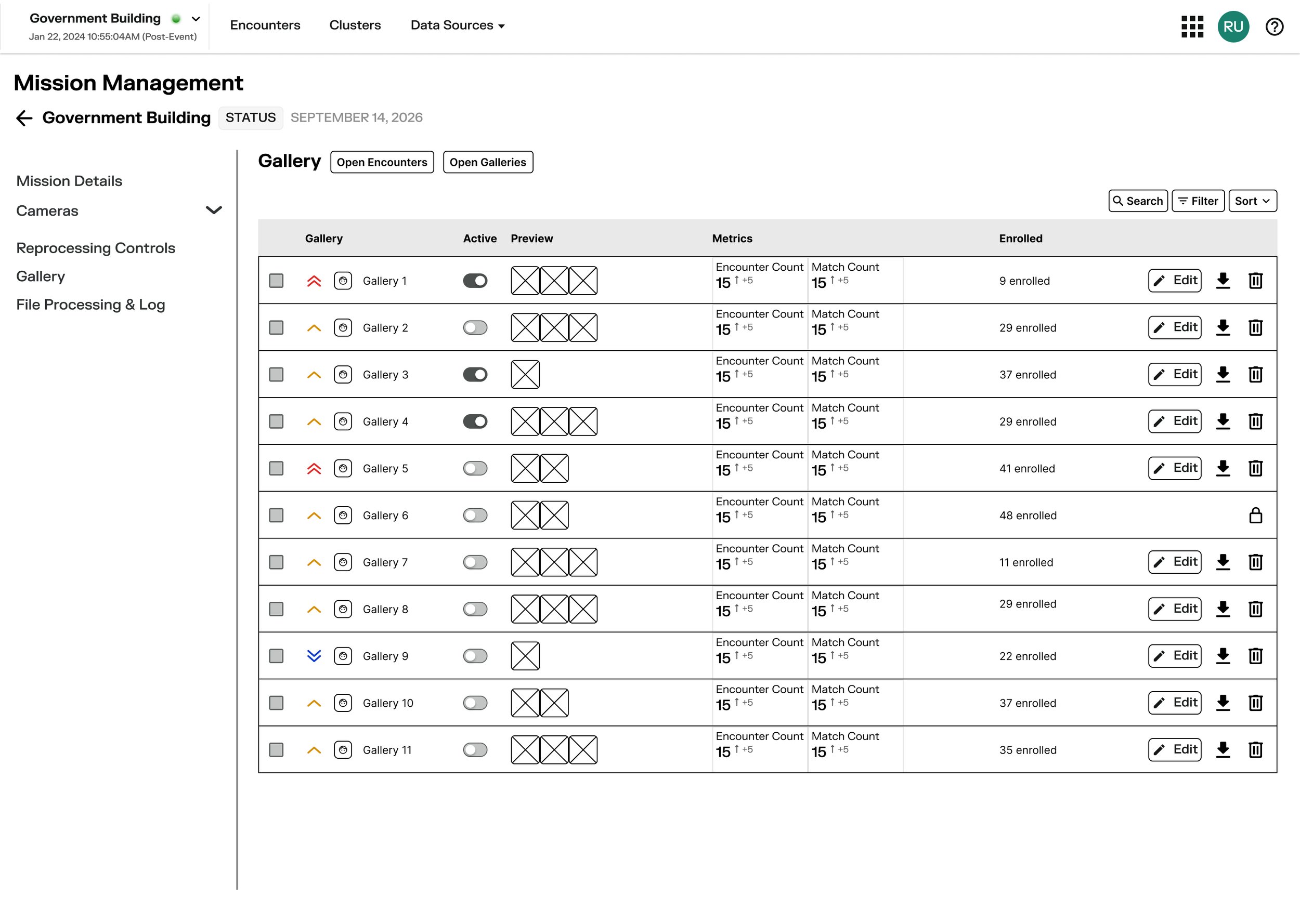
For users who need a more comprehensive view, I designed an option to open the full page for a specific mission.
This dedicated experience provides a separate space to explore mission information in greater depth while keeping the current priority selection intact.
Why two experiences?
The two approaches support different levels of exploration. The modal offers a more immediate way to review information, while the full page provides a dedicated destination for a more complete view.
This design approach uses progressive disclosure by allowing users to access information at different levels of detail without forcing every interaction into the same experience.
Final Process
The final prototype brought the two mission information experiences together within ROC Watch.
Experience 1: Review mission details in a modal
The modal provides a way to access mission information directly from the existing interface.
The design intent was to reduce the need for additional navigation when users only need to review information about a specific mission.
Design focus:
Access mission details within the current interface.
Keep the experience focused on the selected mission.
Support quick information review without requiring a full-page transition.
Experience 2: Open the full mission page
The full mission page provides a dedicated view for exploring a specific mission's information.
Rather than requiring users to change their current priority selection to access another mission's details, the design provides a separate path for reviewing that mission.
Design focus:
Provide a dedicated destination for comprehensive mission information.
Give users an alternative to the modal when they need a fuller view.
Preserve continuity with the current priority selection.
A more flexible information experience
Together, the modal and full page give operators two ways to access mission information based on their needs. The proposed experience aims to balance quick access, deeper exploration, and continuity within the operational workflow.
Outcome
The project resulted in a high-fidelity prototype introducing two complementary ways for operators to access mission information:
A mission details modal for reviewing information within the current interface.
A dedicated full mission page for exploring a specific mission in greater depth.
The design addressed the project goal of providing flexible access to mission details without requiring users to change their current priority selection.
Because the project concluded at the prototype stage, improvements to usability, task completion time, or operational efficiency have not been established. These would need to be evaluated through further testing.
Reflection
This project reinforced the importance of designing information access around the user's workflow rather than treating every interaction as a navigation problem.
One of the key design considerations was balancing immediate access to information with the need for a more comprehensive view. By exploring both a modal and a dedicated page, I developed a proposed experience that accommodates different levels of information exploration while preserving the user's current priority selection.
If I continued the project, I would conduct usability testing with representative operators to evaluate whether the two experiences support their needs.
I would focus on three questions:
Can users quickly locate and open the details of a specific mission?
Do users understand when to use the modal versus the full mission page?
Can users explore mission information without unintentionally changing their current priority selection?
The results would help validate the interaction model, identify points of confusion, and inform further iterations.
Overall, this project strengthened my ability to structure complex information, consider the relationship between interface interactions and operational workflows, and translate product requirements into a focused design solution.